Interactive Visualization of EHRData with Vitessce#
This tutorial demonstrates how to create interactive visualizations of EHRData objects using Vitessce [KGM+25].
Vitessce provides linked, coordinated views that allow you to explore clinical data interactively in a web browser or Jupyter notebook.
Note
Prerequisites: This tutorial assumes familiarity with the concepts from:
Getting Started - Understanding the EHRData structure
Real Dataset Example: PhysioNet 2019 - Working with real clinical data
Load Data#
We’ll use the PhysioNet 2019 Challenge dataset, which contains time series measurements from ICU patients:
4,000 patients (subsampled from 40,336 for faster loading)
35 clinical variables including vital signs (HR, O2Sat, Temp, BP), lab values (Glucose, Lactate, WBC), and the sepsis label
48 hours of measurements after ICU admission
Outcome: Sepsis onset prediction (
SepsisLabel)
This dataset is ideal for exploring clinical patterns related to sepsis development [RJJ+20] [GAG+00].
import ehrdata as ed
edata = ed.dt.physionet2019(layer="tem_data", n_samples=4000)
edata
View of EHRData object with n_obs × n_vars × n_t = 4000 × 35 × 48
    obs: 'Age', 'Gender', 'Unit1', 'Unit2', 'HospAdmTime', 'training_Set'
    var: 'Parameter'
    tem: '0', '1', '2', '3', '4', '5', '6', '7', '8', '9', '10', '11', '12', '13', '14', '15', '16', '17', '18', '19', '20', '21', '22', '23', '24', '25', '26', '27', '28', '29', '30', '31', '32', '33', '34', '35', '36', '37', '38', '39', '40', '41', '42', '43', '44', '45', '46', '47'
    layers: 'tem_data'
    shape of .tem_data: (4000, 35, 48)
Generate Vitessce Configuration#
Vitessce creates interactive widgets directly in Jupyter notebooks with linked, coordinated views. When you select data in one view, all other views update automatically - making it easy to explore patterns across different visualizations simultaneously.
The library is highly customizable with many view types and configuration options. See the vitessce-python documentation for comprehensive examples and advanced configurations.
ehrdata provides a quickstart via ed.integrations.vitessce.gen_default_config(), which creates a sensible default configuration for clinical time series data. You can specify:
obs_columns: Patient attributes to group by (e.g., gender, ICU type)scatter_var_cols: Variables to plot in a scatterplotobs_embedding: Dimensionality reduction for patient representations in a 2D scatterplot (e.g., PCA)layerandtimestep: Which time series layer and timepoint to visualize
Lets take a look at this in action.
vc = ed.integrations.vitessce.gen_default_config(
    edata,
    obs_columns=["Gender", "Age", "training_Set"],
    scatter_var_cols=["HR", "MAP"],
    layer="tem_data",
    timestep=10,
)
vc.widget()
The output should look like this (and can be rearranged):
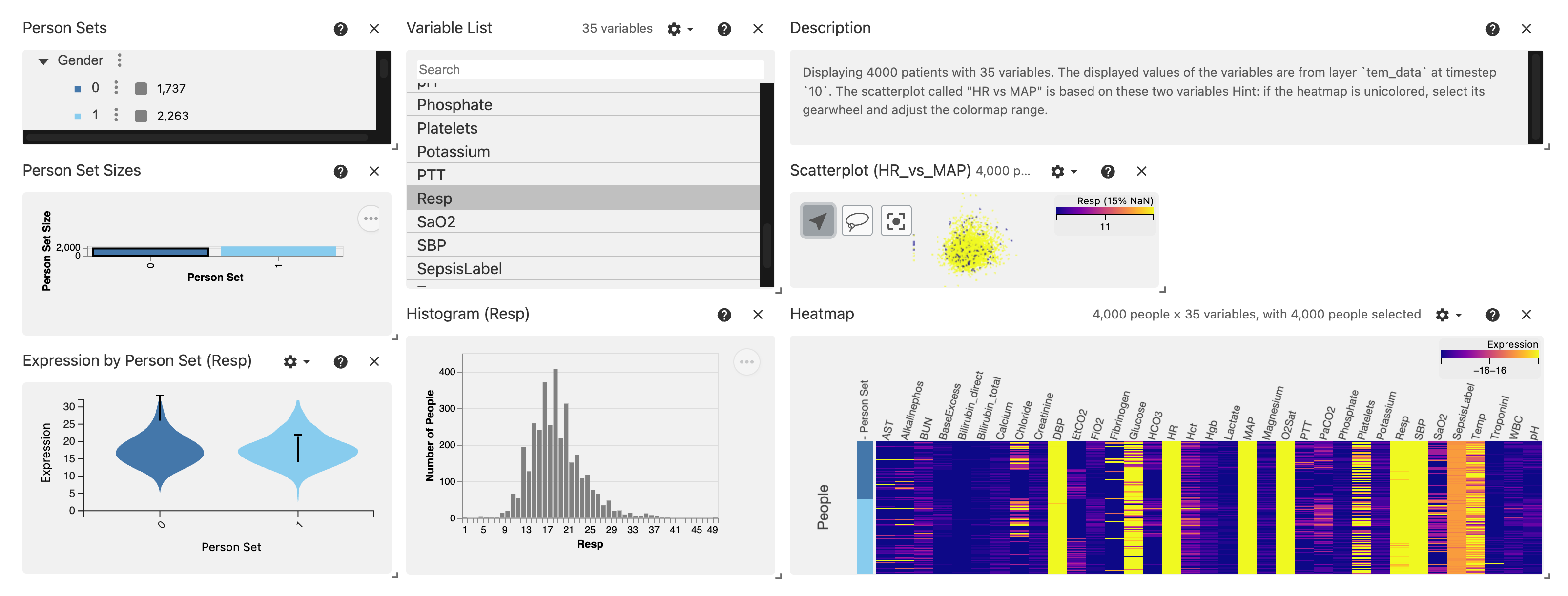
View Components#
View |
Description |
|---|---|
Person Sets (top left) |
Hierarchical grouping of patients by categorical variables (Gender, ICU Type, etc.) |
Variable List (top middle) |
List of clinical variables to select for visualization |
Description (top right) |
A summary of the values shown based on the selection with |
Person Set Sizes (middle left) |
Bar chart showing patient counts per group |
Scatterplot (middle right) |
Patients positioned by PCA embedding, colored by selected group |
Violinplot (bottom left) |
Comparison of distribution between selected Person Sets |
Histograms (bottom middle) |
Distribution of selected variable values |
Heatmap (bottom right) |
Matrix view of variable values across patients |
The Person Sets allow us to toggle groups 0 (Female) or 1 (Male). It is used as grouping variable for the Violinplot.
The Variable List allows the toggle the variable of interest. Here, we show the Resp variable, which is the respiratory rate (breaths per minute). It steers which variable is used in the Violinplot, and on the histogram.
Remember: we have chosen the time interval 10 for every variable for every patient, which here translates to the respiratory rate measured during the 10th hour the patients are in the ICU.
The Heatmap provides an overview of the variables, grouped by the Person Sets. Its color grading can be adjusted by clicking on the wheel icon, to adjust for variables on potentially different scales.
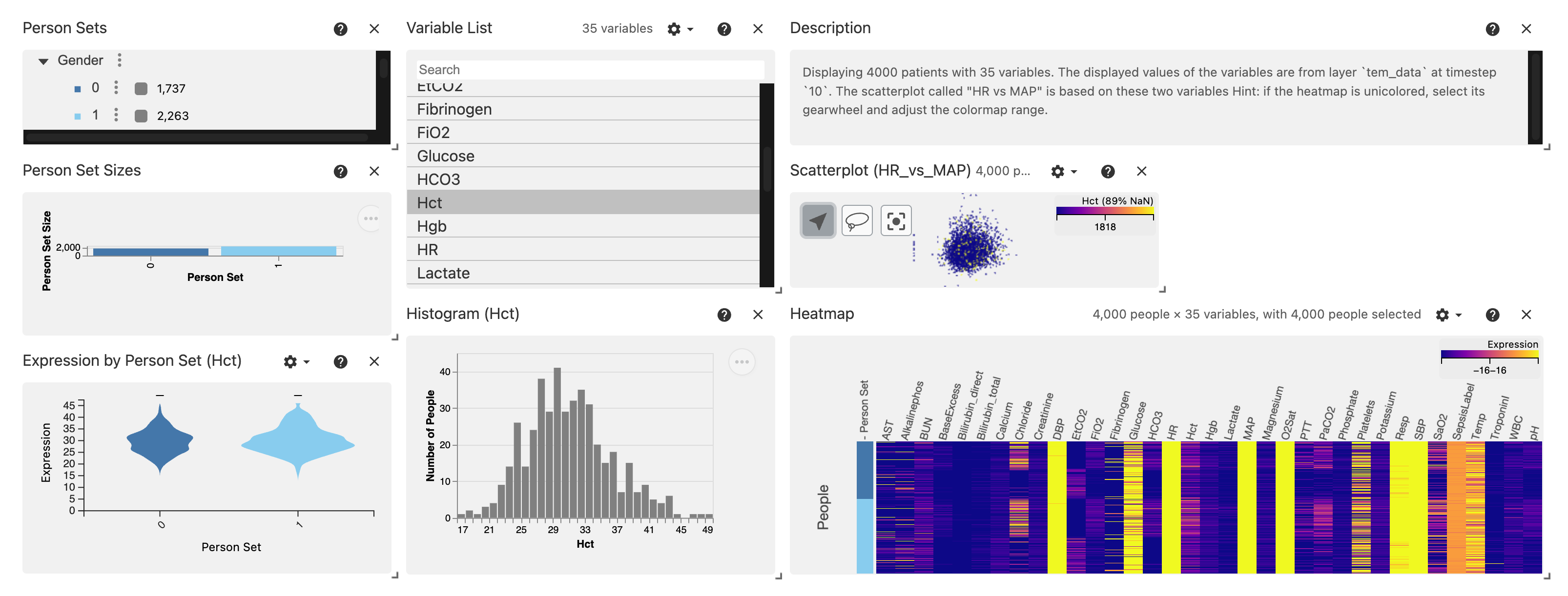
The power of Vitessce really starts to shine when you interact with the views, while all of them are linked and update each other based on what you’re looking at!
For instance, we can choose another variable (e.g. Hct, the Hematocrit) at hour 10 after ICU entry with just 1 click:
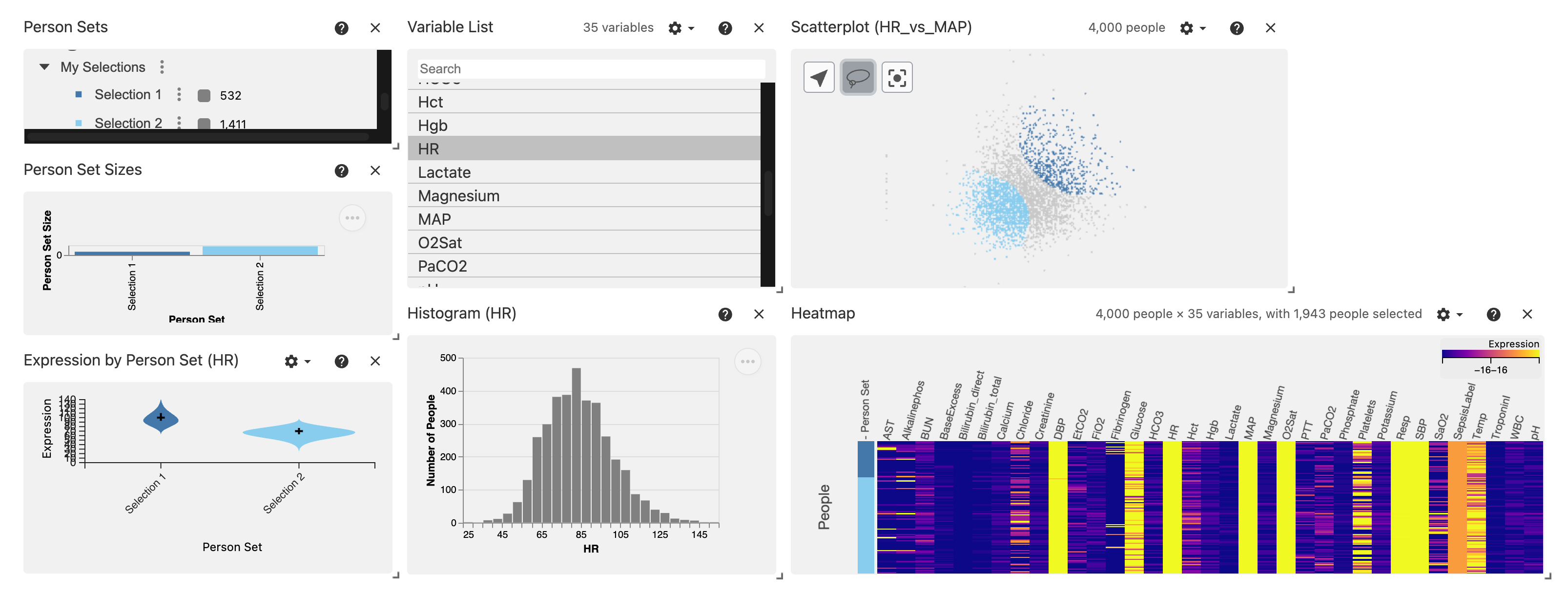
Vitessce offers a powerful way to compare groups based on a lasso on the Scatterplot.
Simply select the Lasso Icon (we made the Scatterplot slightly larger for this), and circle those groups you want to explore based on their scatterplot profile - run this notebook to try it yourself!
Here, we compare the HR (Heart Rate, beats per minute) variable between two selected groups.
This becomes particularly interesting when considering representation-learning approaches that provide meaningful representations learnt from complex data - see the machine learning notebooks of ehrdata and ehrapy to see how such approaches are readily available when moving in this ecosystem!
Advanced#
The visualization can be tuned, and be made to incorporate e.g. multiple Scatterplots!
See the vitessce-python Documentation for more details and examples.
Further Resources#
Vitessce - The Vitessce visual integration tool for exploration of spatial single-cell experiments
vitessce-python Documentation - Python API documentation for Vitessce